Brand
Identity
The visual language of Vauxite — logos, colors, and typography crafted to communicate precision, innovation, and trust.
Vauxite Crystal
The core of our identity — an interactive crystal that responds to your movement, symbolizing clarity, innovation, and depth. Hover over it to see the light follow your cursor, representing our commitment to dynamic, user-centric digital experiences.
The Vauxite Mark
Our logo is the cornerstone of our visual identity. Use it with care, consistency, and adequate clear space on all backgrounds.
Do: Maintain clear space
Always surround the logo with clear space equal to the height of the "V" in VAUXITE on all sides.
Do: Use approved colorways
Use the logo on dark, white, or brand-purple backgrounds. Always maintain contrast and legibility.
Don't: Stretch or distort
Never alter the aspect ratio, apply drop shadows, rotate, or add effects not part of the original design.
Don't: Place on busy backgrounds
Avoid placing the logo over complex imagery or patterns that reduce legibility and visual impact.

https://vauxite.net
Wednesday, 08 July 2026
The Crystal in Action
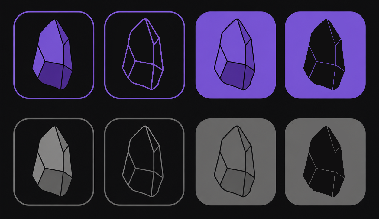
Explore all the different color variations and styles of our signature crystal mark. From electric purple to vibrant cyan, each variation maintains the same geometric precision.
Official Colors
Our palette is built on depth and precision — deep space darks anchored by electric purple and cyan accents. Click any hex code to copy it.
Type System
Three typefaces form our typographic hierarchy — each chosen for legibility, personality, and performance across all platforms.
The modern interface typeface
Clean geometric warmth